
For the last few months we’ve been sharing our favorite news stories and articles about mapping from around the globe. We created the series back in October to celebrate our love of maps—and to highlight the fact that maps are literally all around us. They are everywhere. Why? Because maps create the opportunity to present extremely complex data in a way that most people can digest and understand. Maps tell stories. They persuade. They change minds. They lead people to act. They inform.
Another month has passed and we have a whole new batch of stories to share with you. Here are the 7 most interesting mapping stories from November:
1. China Tightens Control of Online Maps
This article reports on the recent news that China has announced that all digital maps provided in the country must be stored on servers within its borders. A blurb from the article states that, “According to China’s state-run Xinhua news agency, the purpose of the new regulations is to “boost development of the geographic information industry” and safeguard “national sovereignty and geographic information security.”
This announcement would make it seemingly a lot more challenging for companies like Google to regain the opportunity to return to China (it has been banned from the country since 2010).
It’s an interesting article because it highlights the challenge that exists when it comes to offering advanced mapping technology to people in other parts of the world.
2. Mapping Global ISIS attacks
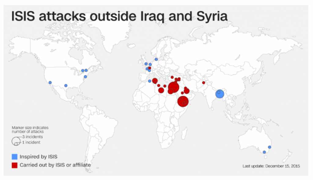
This story uses mapping to illustrate the terror that ISIS has been creating in pockets all around the world. According to the article, “Since declaring its caliphate in June 2014, the self-proclaimed Islamic State has conducted or inspired at least 50 terrorist attacks in 18 countries that have killed 1,100 people and injured more than 1,700 others.”
The maps included in the article are not interactive, but there are a number of different views that have been created and placed throughout the article to help visualize attacks in different parts of the world.
This is a helpful example that shows how powerful mapping can be in visualizing data that is incredibly complex, spread out across large geographic areas, and difficult to comprehend by reading text alone.
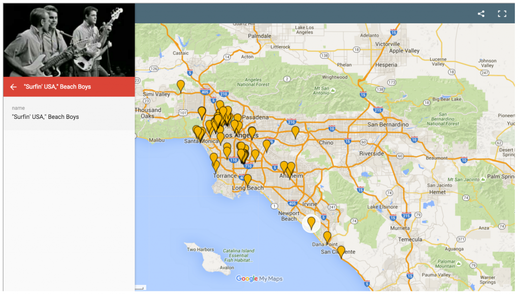
This article introduces a mapping-related concept that we found particularly interesting. According to the article, “aboriginal Australians have a concept called “songlines” — in which they use songs as a map to navigate through a physical landscape. Songlines don’t just evoke a particular experience or moment, they connect those experiences to specific places.”
It then introduces ‘songlines’ to show how music has influenced various neighborhoods throughout the L.A. area. It’s an incredibly interesting article that ties social, demographic, and historical data with locations on a map—a great example of the power and endless opportunities that exist when it comes to mapping.
4. Uber has hired another Google Maps exec
In a continued quest to build its own mapping technology, this article reports that on ride-sharing giant Uber has hired another former Google Maps employee to join their ranks. Manik Gupta was at Google for seven years, and follows another former Google Maps employee who joined Uber last summer.
The reasoning behind the recent hirings is explained in further detail in the article: “Uber is trying to move away from its reliance on Google’s mapping system and wants to control its own assets as it looks to expand beyond taxis. Last week, Ryan Graves, Uber’s head of global operations told CNBC that the company increasingly sees itself as a “logistics platform” as it experiments with food deliveries and even delivering flu jabs.”
5. Runner’s Routes Make Star Wars Maps
We couldn’t publish this month’s blog post without sneaking in at least one Star Wars reference! 🙂
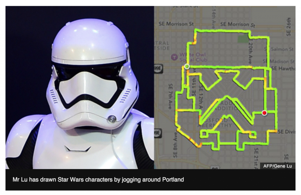
This article tells the incredibly cool story of Gene Lu, a Portland man who is literally planning and running Star Wars-themed routes around the city. According to the article: “Gene Lu is plotting his courses via the Nike+ app, and so far has courses that look like Darth Vader, a Stormtrooper, an AT-AT and a TIE Fighter — which clearly means Lu is on the Dark Side. He also posts detailed images of the directions via Dropbox, and all his routes can be found via Instagram.”
It’s a great example that illustrates how present mapping is in all of our daily lives—even if we don’t always think bout it or realize it.
6. Mapping The State Of U.S. Student Debt
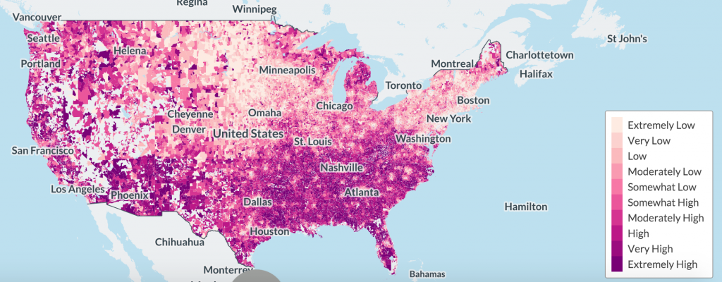
The map in this article illustrates student debt across the U.S. by zip code. An excerpt from the article explains what the data reveals:
“The maps show that people are most likely to fall behind on their payments when they come from poorer neighborhoods, and—counterintuitively—that people with higher rates of debt are less likely to default. Households with income of $100,000 a year are four times less likely to default than people on $20,000, even though the first group’s debts are relatively much larger. That indicates that a good college degree is very much still worth having—you can pay back your debts—but that having a lot of debt from a bad college is a millstone around your neck.”
To explore this interactive map, click here.
7. New Mapping Technology Helps Arctic Communities “Keep on Top” of Sea Ice Changes
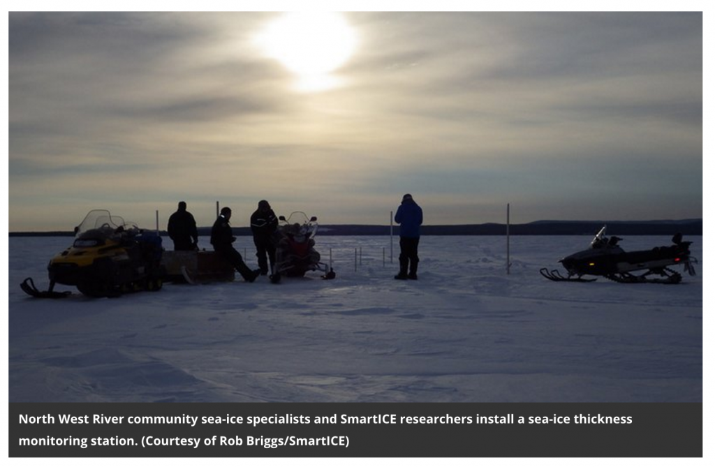
This article explains how Sea-ice Monitoring and Real-Time Information for Coastal Environments, or SmartICE is helping people living in Arctic communities stay ahead of the ever-changing freezing patterns that people rely on for hunting and traveling.
Here’s how the system works, according to the article:
Before the primary ice season, buoys will be places by technicians in various locations until the ice freezes around them. Sensors in the buoys will record information on ice thickness and snow cover. From there:
“This data will be combined with other satellite information to create thematic maps colored in different ways to represent types of ice important to Inuit. Categories like rough ice (what happens when wind blows thin levels of ice on top of each other early in the season, creating a curtain-like effect), double ice (what happens when a thin layer of ice freezes over a pond of meltwater on top of a lower, thicker ice layer) and smooth ice (the optimal rink-like surface) can all have huge effects on the safety of ice travel.”
It’s another great example the many ways that mapping can be used to make life better, easier, and more prosperous for communities in pockets all over the world.
Want to catch up on the stories we shared in previous months? Click here to read through the post from October, and click here to read through the post from November.
Fred Metterhausen is a Chicago based computer programmer, and product owner of the current version of Maptive. He has over 15 years of experience developing mapping applications as a freelance developer, including 12 with Maptive. He has seen how thousands of companies have used mapping to optimize various aspects of their workflow.
