Did you know that 90% of the information processed by the human brain is visual? And yet, we are often asked to make sense of raw spreadsheets and endless columns of numbers. As big data continues to grow exponentially, we face the challenge of extrapolating the valuable insights it contains–but uncovering them without the right tools can feel like searching for a needle in a haystack.
This is where data visualization software comes in handy. By transforming raw data into clear, engaging visuals it empowers users to see trends, identify opportunities, and make decisions. Whether you’re a marketer trying to track campaign performance or a logistics manager optimizing delivery routes, visualizing your data can make all the difference.
Table of Contents

Data visualization software transforms raw data into visual formats like charts, graphs, heatmaps, and interactive dashboards–bridging the gap between complex datasets and actionable insights.
Sifting through endless rows of numbers in a spreadsheet is overwhelming and time-consuming–and, worst of all can often lead to mistakes. But suppose you could look at that same data represented as a map showing sales performance by region or a bar graph highlighting year-over-year growth. In that case, you can easily understand the story your data was trying to tell you all along.
This type of software is used across industries—from finance to healthcare, logistics to retail. By simplifying data analysis and communication, data visualization software enables organizations to make smarter, faster decisions. Tools like Maptive go a step further by offering customizable features that cater to the unique needs of any business.
Here are 8 compelling reasons why you too should add data visualization software to your toolbox:
Raw data is often messy and difficult to interpret, but data visualization software converts it into meaningful visuals that are easy to understand.
Instead of staring at endless spreadsheets, you can see the bigger picture and focus on what matters most—whether it’s sales performance, customer behavior, or operational efficiency.
Not everyone speaks the language of data, but everyone understands visuals. Data visualization bridges the gap between technical analysts and non-technical stakeholders by presenting complex information in a way that’s easy to grasp. This means faster decision-making and better alignment across departments.
Manually creating charts and graphs is a thing of the past. Data visualization tools like Maptive allow you to automate the process, freeing up valuable time for analysis and strategy. With just a few clicks, you can generate updated visual reports and focus on making decisions instead of preparing slides.
Visualizations make it easier to see trends, patterns, and anomalies that might be buried in rows of data.
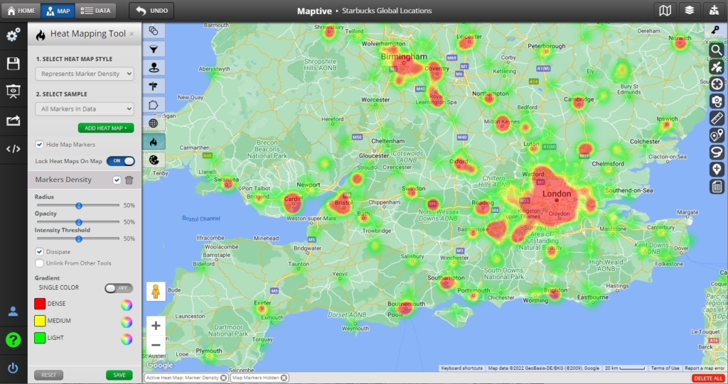
For instance, a heatmap can quickly highlight areas of high activity, helping you identify where to focus your resources. Spotting these insights sooner can give your business a competitive edge.
When you can clearly see what your data is telling you, it’s easier to make informed decisions. Data visualization software helps eliminate guesswork, allowing you to rely on accurate, data-backed insights. Whether you’re optimizing a marketing campaign or planning a supply chain, confidence in your data is key.
Static slides and tables are a thing of the past. Today’s data visualization tools let you create interactive maps and dashboards that keep your audience engaged. Your team can explore the data themselves, adding a new level of understanding and trust in your insights.
Every business has unique needs, and data visualization software adapts to meet them. Whether you’re a small startup or a large corporation, tools like Maptive allow you to customize features and scale your visualizations as your data grows.
Data is the new currency and businesses that fail to harness its power risk falling behind. By using data visualization software, you ensure that your organization stays competitive, agile, and prepared for whatever challenges the future holds.

Maptive stands out among data visualization solutions by offering a combination of user-friendly features, powerful customization options, and unparalleled versatility. Here’s why Maptive is the ideal choice for businesses looking to transform their data:

Getting started with Maptive is quick and easy. Follow these steps to begin transforming your data into actionable insights today:
Brad Crisp is the CEO at Maptive.com, based in Denver, CO and born in San Francisco, CA. He has extensive experience in Business Mapping, GIS, Data Visualization, Mapping Data Analytics and all forms of software development. His career includes Software Development and Venture Capital dating back to 1998 at businesses like Maptive, GlobalMojo (now Giving Assistant), KPG Ventures, Loopnet, NextCard, and Banking.
